Thursday, 1 December 2011

Coursework - Local Interview

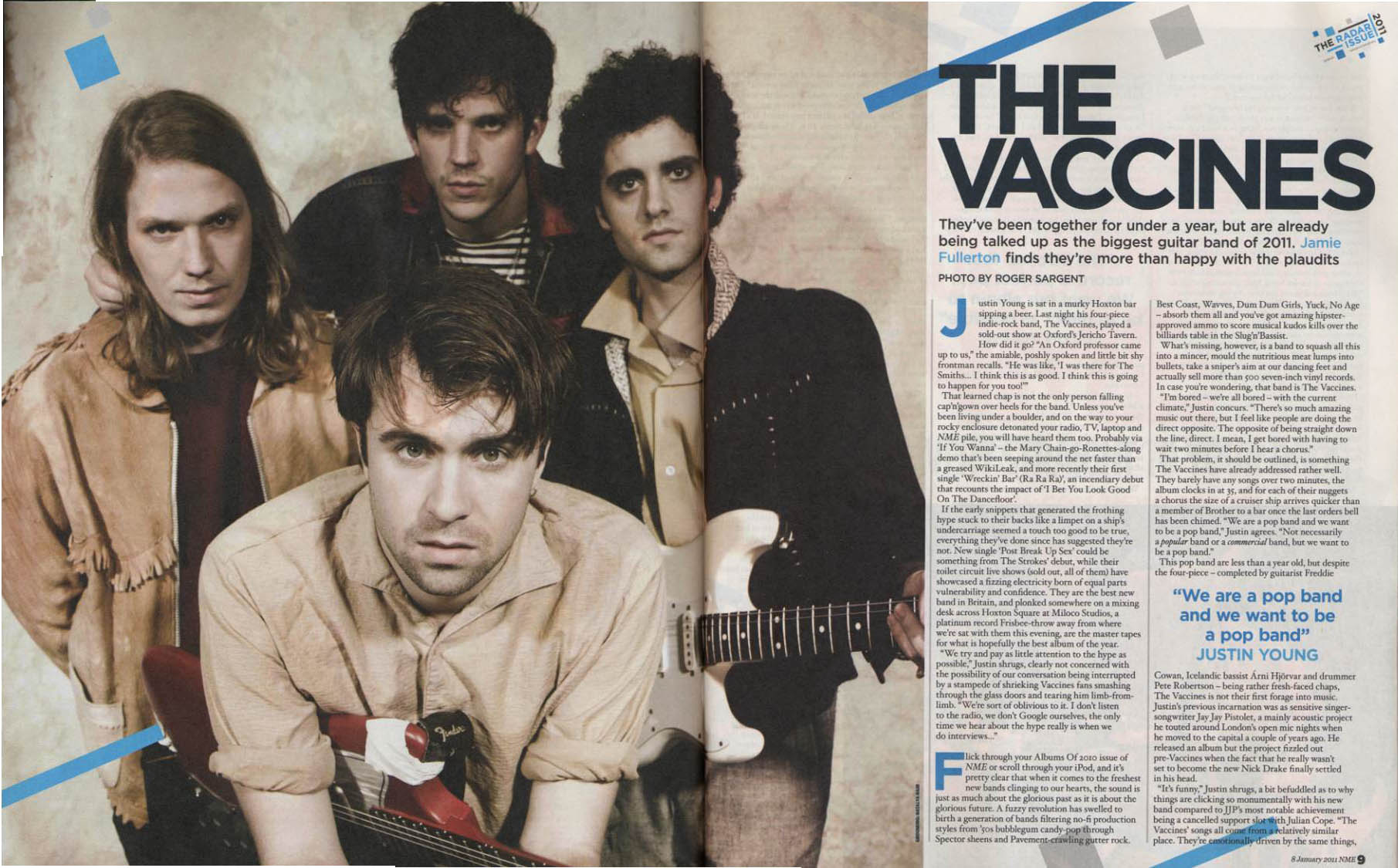
Over the past few weeks I have conducted my very own interview with a close friend who is aspiring to be an artist, not only does she succeed in writing and acoustically rehersing her own songs, she also does feature copies of previously recorded songs. I have chosen to conduct an interview with her because I felt it was important to get a feel for how I would like my final interview featured on my double page spread to turn out. Although this was extremely helpful in my research stage it was only a brief and general interview. 

Here is a mock-up of the interview; 

Amy-Leigh is living a life only few could dream of. Aspiring to be a successful artist she has broadened her music around the local area and it is only a matter of months before her music is heard and engaged with by the founders of music lovers. As we take a step closer to into her thinking behind her personal songs she reveals the longing she's been needing to release about all her hard efforts, will they finally pay off? 

Amy, your aiming for the indie-chic look today, is fashion something that's important to you?
Always, I find myself browsing all the time! I've always been a sucker for delving into 'vogue' but I am human, I love wearing joggers and a baggy t-shirt!

Don't we all! Do you think the media puts too much pressure on us to have a slimming figure?
Yes, whever you look there's always promotions for diets and healthy eating choices, whatever happened to ten being a size?

We agree. Do you believe more in the music than the image your providing?
I've grown up with music in my life for over twenty years, its the music that counts, a lyric can be so emotive and creative, something that your fans can connect with and I think if your fans understand your music then they'll accept you without thinking about it.

You've been sharing your music for more than seven years now, are you prepared to alter your style and play around with different sounds?
I'm always looking for a challenge and one that is difficult to overcome is what excites me about this industry. 

You haven't yet been signed to a major label, do you not think changing your sound will alter your fan base?
It's a difficult thing to decide. My fans are my fans because they love the music I write, it has a meaning and comes from personal experiences, but I think most would be accepting of what I have to offer! (laughs)

We'll always be listening! Is your music always related to personal issues?
Mostly, they come from the broken hearts and the issues with love.

Have you had your heart broken recently?
There's a be a few in my time...(laughs) 

The interview above was a small 'snapshot' of the overall interview I did with Amy-Leigh. I chose that part of the interview because I felt it educated the readers about her music with minor detail on her herself and also kept the answers quite light hearted in order for the reader to enjoy what they are reading for entertainment purposes. When thinking about my final interview in my magazine I will look to add more detail, make the questions fit the audience and the aim as well as using entertainment features. However this interview was only used for research purposes, and I believe it will help me get a better understanding when it comes to my final coursework.

Coursework - Music Magazine Interviews

Research into double page spreads produced by music magazines has allowed me to get a clearer idea of how I want my audience to percieve my given text when it comes down to creating my coursework. I have noted that almost all double page spreads will include a photographic image of the artist who's interview is being conducted, be it an extravegant image or a simplistic image. Therefore I can use my knowledge on photography in magazines as well as studio lighting and positioning to create the image I need for my double page spread.
I have also learnt that all the interviews begin with the writer's explination of who the artist is and a brief outline of what the interview includes. So it is largely important to focus on this when doing my music magazine as well as ensuring the artist fits the needs of my audience and bodes well with the genre of my magazine edition. When analysing the text, as in questions and answers, it is clear to say that the questions are kept simple but to the point, this allows the reader to stay hooked on what they are reading and get information fast that is also easy to locate. The answers on the other hand tend to be more humourous and light hearted, of course depending on the chosen artist to interview. This is largely important because the reader needs to feel connected to the artist and to feel as if they are there in the interview. I hope to promote this in my music magazine as its mission is to create detail on a level the audience can connect with.
Normally on the top of a double page spread is the artists name alongside a quote featured from the interview that has taken place. I have learnt, as a reader, that this quote needs to be intriuging and eye catching, so altering the text type is essential, playing around different colours is also essential, therefore as a conclusion I will look to have a go with doing this on my double page spread. 

I found this feature page on double page spreads which was shown in an edition of Kerrang music magazine. I was particularly drawn to this image because of the simplicity of the piece allowed my attention to immediately go to the "ABSOLUTELY!" and it was this which made me recognise the importance of having a quote which is going to grip the reader. I also like this page because the text is easy to navigate and the headings in white (The questions) break down the text block, making it less daunting to read. I like the idea of making use of a plain background and really enlarging the foreground image of the artist, who looking directly at the camera. As previously researched this makes the reader feel connected with the magazine and the article in which they are reading. Overall I see this double page spread as being very successful, the use of a neat border brightens up the grayscale background, the only critisism is that prehaps there is not enough text to provide the reader with adequate knowledge, therefore in my music magazine I would make the photographic image smaller and provide more text. 

This double page also features in the magazine of Kerrang. I have chosen this piece because it appears so chaotic and packed full of information that it actually works well and wants me as a reader to understand what is being written. The use of the image of the world at the top of the page makes the reader assume this could be a travel topic, prehaps someone going on tour, but I like the idea of having an image that is not the artist themselves but is related to the feature story in some way. The only negative about this is that the amount of text placed together in one block is enough to turn the reader away, if it was broken down into smaller sections it may be more inviting for the reader. In conclusion I like this magazine although I will not look at using it for emulation as the colour scheme and overall outlook on the piece appears, to me, to be leaning on a more masculine and male audience whereas I am looking to create an upbeat signature magazine which is more gender bias towards females. 

Below are a few images of magazine double page spreads in which I have chosen to select because of their appearence and because I was easily drawn into wanting to read more. These are the double page spreads in which I think are successful; 


Coursework - Music Magazine Photographers

I have conducted research on the type of photographers popular music magazines use as their portfolios in their magazines. Such photographers are found in magazines like mojo, kerrang and Q. 
The most common names for music magazine researchers is Andrew Cotterill, Andy Fallon, Paul Harries, Mick Hutson, Rodger Sargent and Andy Willsher.

Images such as this one have been previously placed in popular music magazines, supplied by the list of photographers shown above. I particularly like the look of this photograph and the band it is representing.

I have done this specific research on photographers because I believe it is important to get an understanding on all sections of music magazines. Photography work is widely incoporated within magazines and I feel that having researched into it I can have a better grasp on a professional look when it comes to completing my coursework.  From what I have gathered, self portriture work is the most common use of photography within magazines, whether or not it portrays a specific part to music or just the artist. Therefore I have concluded that in my final music magazine I will use specific portriture work with an indie twist on the look as that is what I am aiming for. I will also ensure that the artist is looking directly into the camera as this is what many of the magazines achieve with their photography work. This is because it engages the reader and makes them connect to the artist that is being previewed on the front cover.

The Use Of Artificial Lighting In Photography:

When photographers use artificial light they are drawing with light, and photographers normally the light in a way that makes it look natural. Therefore when positioning the lighting you are going to use it is essential that it is positioned where the sun might be in relation to the subject. This is normally fairly high and coming from behind the camera at an off centre angle. The beneficial points of using studio lighting is that you have total control over both the direction of the lighting and the effect of it, creating an image you want to achieve is always successful.

Overall after this research it has become clear that using a studio would allow me to achieve a professional outlook on the photography side of the magazine, therefore I will use this reseach and apply it to my photography work which will be portrayed in my overall music magazine.

Wednesday, 16 November 2011

Coursework - Music Magazines Graphics

What is a graphic?
A graphic is a representation of an image used to convey visual information. Most graphics come under photographs, clip art, line art, digital art, icons and many more.
This image is an example of a coloured graphic. Although it may not be specific to music magazines, it represents a good image of a graphic. The use of colour allows for a chaotic look to the piece but surprisingly they work well together. The parallel lines and symmetrical shapes make for a good graphic because it doesn’t make the image a subjective thing. The difference between a rich textured design and a clean modern design allows for the variation of emotions as well as using eye popping colour or soft pallet colours and occasionally a combination of the both. I think this image portrays this well.

The image of 'Kerrang' music magazine masthead is often shown as the image above. It creates a slight shattered effect which often bodes well the band being advertised on the front. This is a good example of representing what the magazine can offer, a slight rock band effect, promoting rock bands such as 'Metallica'. I really like the graphic used within the title because it isnt instantly noticable but gives the magazine a different outlook.

Overall from the research I have uncovered, I have found out that there are no guidelines as to what makes a good graphic, it is simply using your knowledge of your given task and applying it to the chosen audience. When completing my music magazine I will consider using graphic designs in order to add differentiation between my photo shoot photos and my text type.

Coursework - Music Magazine Typography

‘Panic At The Disco’ are a well known band. I have specifically picked out this advertisement of the band in order to comment on the typography. I really like the colours presented within this media extract, they all compliment one another and blend cleanly with the background. The graphics used within the text allows for a diverse effect, different than if writing the text normally, giving off a worn texture, floral patterns mixed with a vintage style. When looking at advertising on my final music magazine I will look at using the effects of this piece shown above, I particularly like the vintage style of the extract alongside the floral designs, it seems to give off an unexpected effect.
In contrast to the media typography used above, this piece is strictly simplified. The plain grainy white background really allows for the graphics of ‘Stag Dagger’ to stand out. Whilst the text type is closely dense allowing for the reader to want to stop and analyse what is being advertised. Although the graphic is slightly explicit, I like the way vector shapes are built up to allow for a more varied and indifferent style. The main information such as ‘tickets £4’ are written in a vibrant pink mainly for it to catch the reader’s eye. Therefore I really like the desing on this typography because it has a mixture of depth and simple uses of colour.
This music magazine poster became a quick inspiration for me, acting as the basis to extreme and successful uses of typography. The interface between the graphic and the text type really allows for a perspective effect on the words born out of discipline.  The sparse area of the text type really gives the overall presentation of the piece a fresh look, making it easy to read. I especially like the text that is written back to front, although still accessible to read, it makes the whole poster interesting and the effects really add to the unique style.  When thinking about producing my music magazine coursework, I will look into collecting ideas from this media extract as I think it portrays the best typography.
In conclusion, the typography in a media extract, particularly those trying to represent an upcoming feature, places an important emphasis on the overall presentation of the piece. Having background knowledge of typography terminology after carrying out research and having analysed pieces of typography, both in general cases and in music magazines, I feel that I am comfortable to move forward and allow my very own coursework to have good and successful typography.

Tuesday, 15 November 2011

Coursework - Music Magazine Typography

Often, all that’s needed to create a killer music magazine is unique and inspired typographical elements. There are various examples of both great classic and modern music magazine typography already released by music magazine producers.  

Here are seventeen examples of typography which could eventually be used within music magazines. I first began my research by looking at different styles of typography on a general scale before moving it specifically to music magazines. This image allows for different effects and styles to be used rather than just altering the font type. I specifically like the research into typography because most typography’s will include a graphic or altering of the word somehow. I have concluded that is the texts which include graphics that attract the most attention the readers eye. This simple image is one that can be used as a template to the wide variations of typography within the world, which can then later be put forward and concluded with music magazines.

After a brief conclusion of the typography shown above, I went on to carry on with research on specific terminology used in typography, these being the definitions of a typeface, point size, line length and leading. All of which are described below;
Typeface A typeface is an artisitc representation or interpretation of characters. It is simply the way the type looks. Typeface can also be classified as the size of the letter or character of the block type.
Point Size In typography the point is the smallest unit of measure, however it can also be known as the size of the type being used in typography.
Line LengthLine Length is simply the width occupied by a block of typeset text. A block of text or a paragraph has a maximum line length that fits a determined design.
LeadingLeading refers to the distance between the baselines of successive lines of type. Research shows that this term is still used in modern page layout programmes.   

Tuesday, 8 November 2011

Coursework - Music Magazine Research

Now that the Prelminary Task has been successfully completed we are able to move onto studying, analysing and comparing music magazines. After careful research I have produced a music magazine board of particular magazines which have immediately caught my eye, be it because of colour, the central image, the text type, graphics or its successfuless.


Here is a printscreen shot of all the music magazines which have caught a general audiences eye. After doing the research on this particular part of the course I have notably recognised the average criteria needed in order to attract specific audiences. on an overall basis colour is essential, however the colours tone in which are used are dependant on who the audience aim is. I have also noted that using successful people who have easily risen to fame helps the selling point of the magazine.

Overall this image board has allowed me to see the differences and make comparisons between what attracts a music magazine reader and what allows for a greater impact to be made on the audience. I will take forward this research in order to allow for an overall professional finish to my completed music magazine.