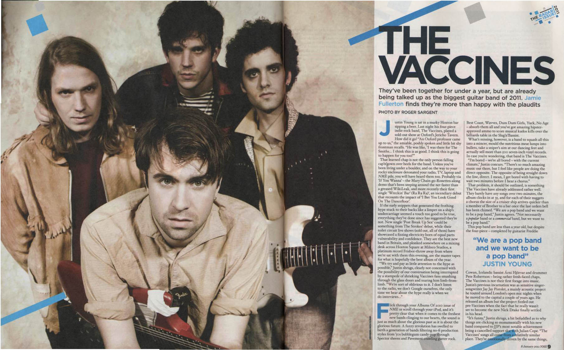
Research into double page spreads produced by music magazines has allowed me to get a clearer idea of how I want my audience to percieve my given text when it comes down to creating my coursework. I have noted that almost all double page spreads will include a photographic image of the artist who's interview is being conducted, be it an extravegant image or a simplistic image. Therefore I can use my knowledge on photography in magazines as well as studio lighting and positioning to create the image I need for my double page spread.
I have also learnt that all the interviews begin with the writer's explination of who the artist is and a brief outline of what the interview includes. So it is largely important to focus on this when doing my music magazine as well as ensuring the artist fits the needs of my audience and bodes well with the genre of my magazine edition. When analysing the text, as in questions and answers, it is clear to say that the questions are kept simple but to the point, this allows the reader to stay hooked on what they are reading and get information fast that is also easy to locate. The answers on the other hand tend to be more humourous and light hearted, of course depending on the chosen artist to interview. This is largely important because the reader needs to feel connected to the artist and to feel as if they are there in the interview. I hope to promote this in my music magazine as its mission is to create detail on a level the audience can connect with.
Normally on the top of a double page spread is the artists name alongside a quote featured from the interview that has taken place. I have learnt, as a reader, that this quote needs to be intriuging and eye catching, so altering the text type is essential, playing around different colours is also essential, therefore as a conclusion I will look to have a go with doing this on my double page spread.
I found this feature page on double page spreads which was shown in an edition of Kerrang music magazine. I was particularly drawn to this image because of the simplicity of the piece allowed my attention to immediately go to the "ABSOLUTELY!" and it was this which made me recognise the importance of having a quote which is going to grip the reader. I also like this page because the text is easy to navigate and the headings in white (The questions) break down the text block, making it less daunting to read. I like the idea of making use of a plain background and really enlarging the foreground image of the artist, who looking directly at the camera. As previously researched this makes the reader feel connected with the magazine and the article in which they are reading. Overall I see this double page spread as being very successful, the use of a neat border brightens up the grayscale background, the only critisism is that prehaps there is not enough text to provide the reader with adequate knowledge, therefore in my music magazine I would make the photographic image smaller and provide more text.
This double page also features in the magazine of Kerrang. I have chosen this piece because it appears so chaotic and packed full of information that it actually works well and wants me as a reader to understand what is being written. The use of the image of the world at the top of the page makes the reader assume this could be a travel topic, prehaps someone going on tour, but I like the idea of having an image that is not the artist themselves but is related to the feature story in some way. The only negative about this is that the amount of text placed together in one block is enough to turn the reader away, if it was broken down into smaller sections it may be more inviting for the reader. In conclusion I like this magazine although I will not look at using it for emulation as the colour scheme and overall outlook on the piece appears, to me, to be leaning on a more masculine and male audience whereas I am looking to create an upbeat signature magazine which is more gender bias towards females.
Below are a few images of magazine double page spreads in which I have chosen to select because of their appearence and because I was easily drawn into wanting to read more. These are the double page spreads in which I think are successful;


No comments:
Post a Comment